Becoming a leading actor in the world of payments, with a friendly yet bold approach. This is Yabie.
A track record of multiple acquisitions and rocketing growth, but with a dusty brand book, made the choice of a new brand easy for Yabie. With a new, colourful branding by Kurppa Hosk, Yabie was set to conquer the Nordic market in style. Empowering their merchants by following the values of Bold, Diverse, Friendly, and Intuitive is at the core of the brand.
The work
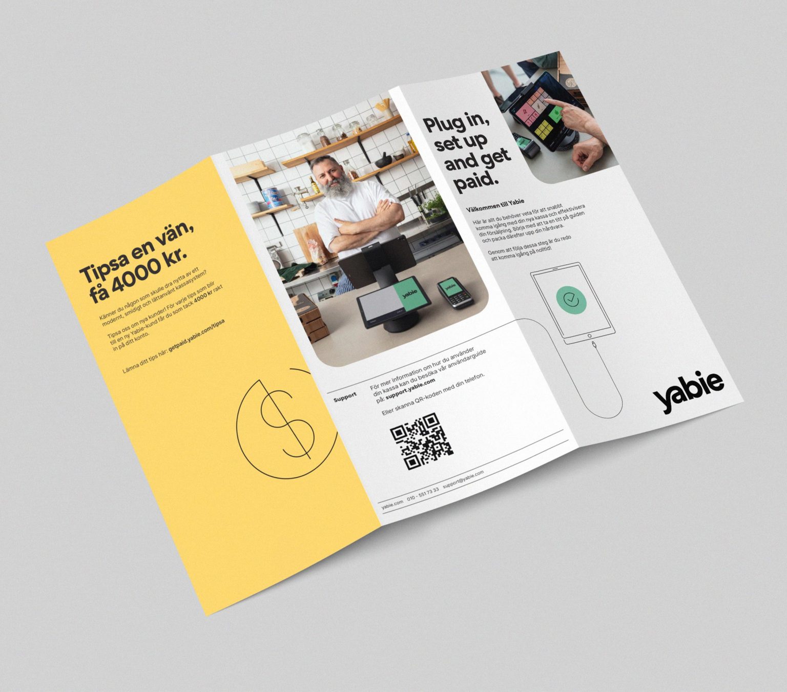
Leaving stock imagery and outsourced design work behind, to become a self-sufficient brand.
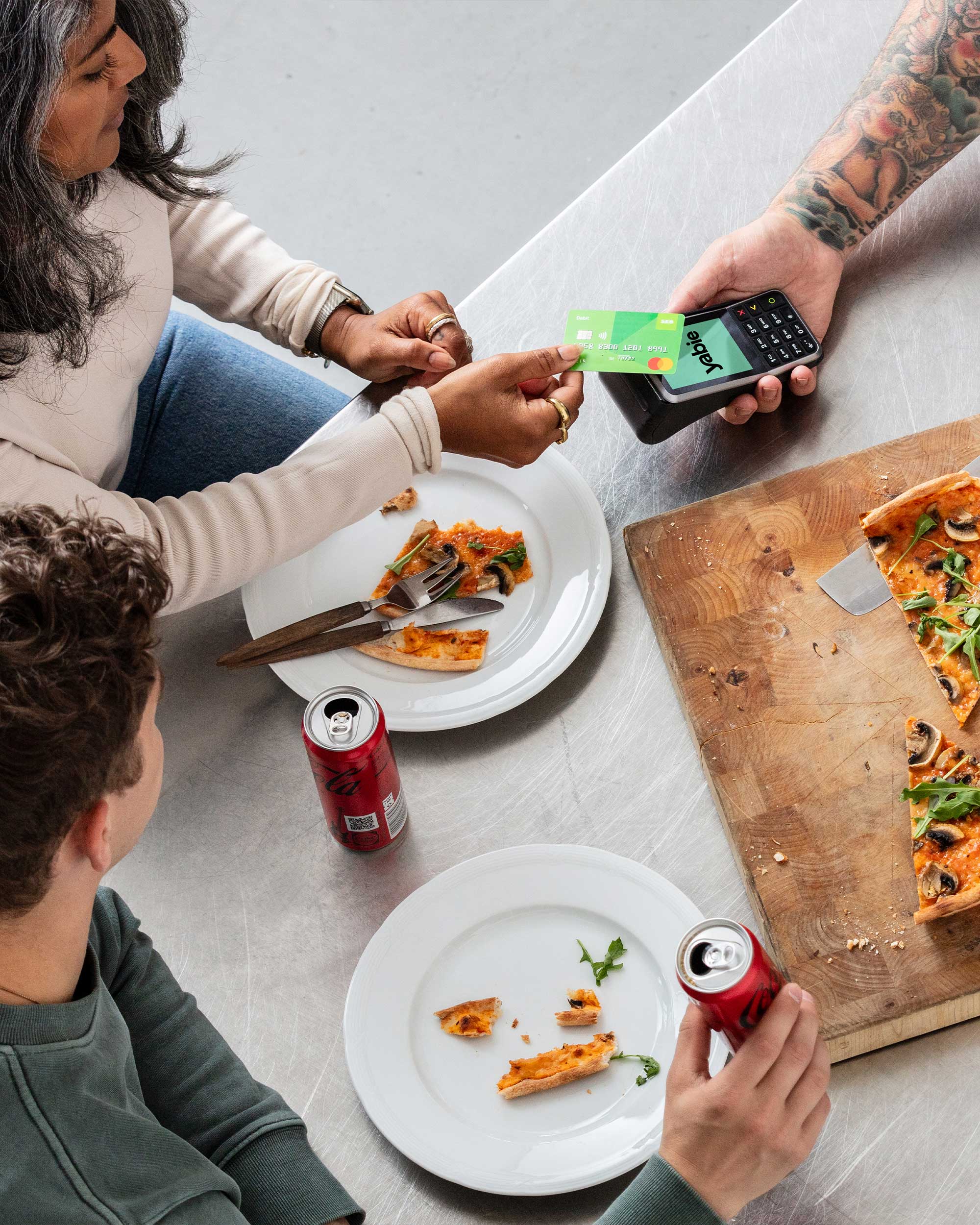
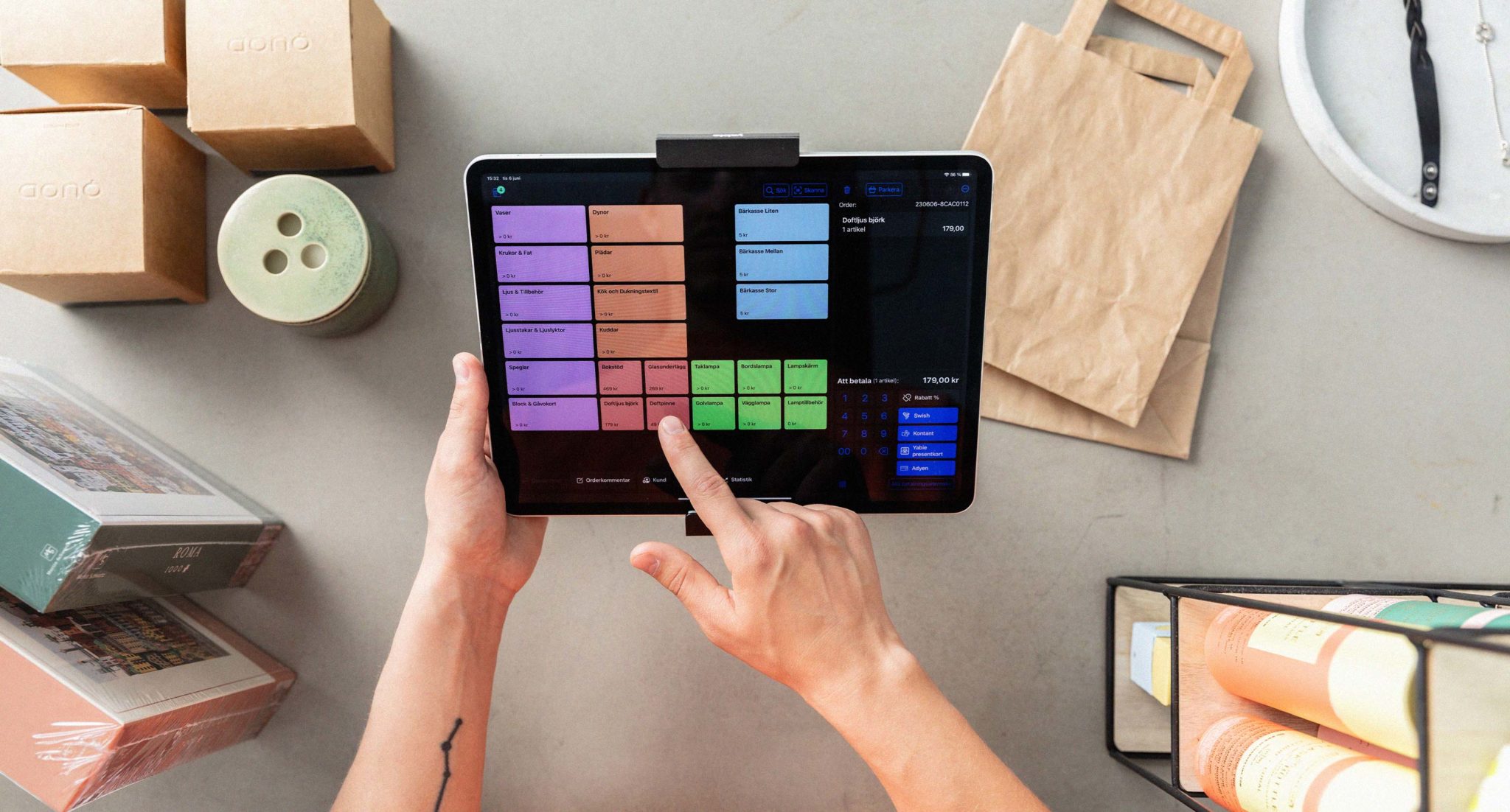
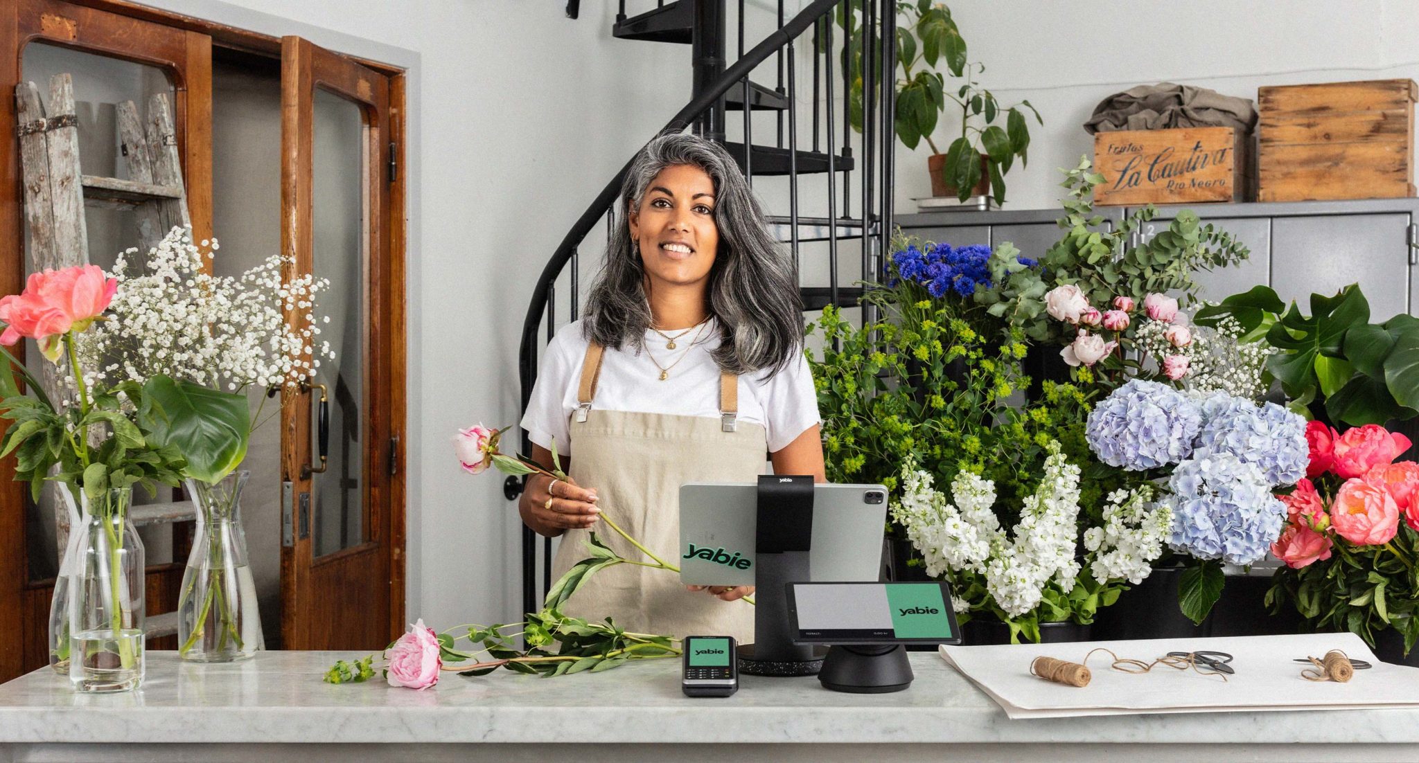
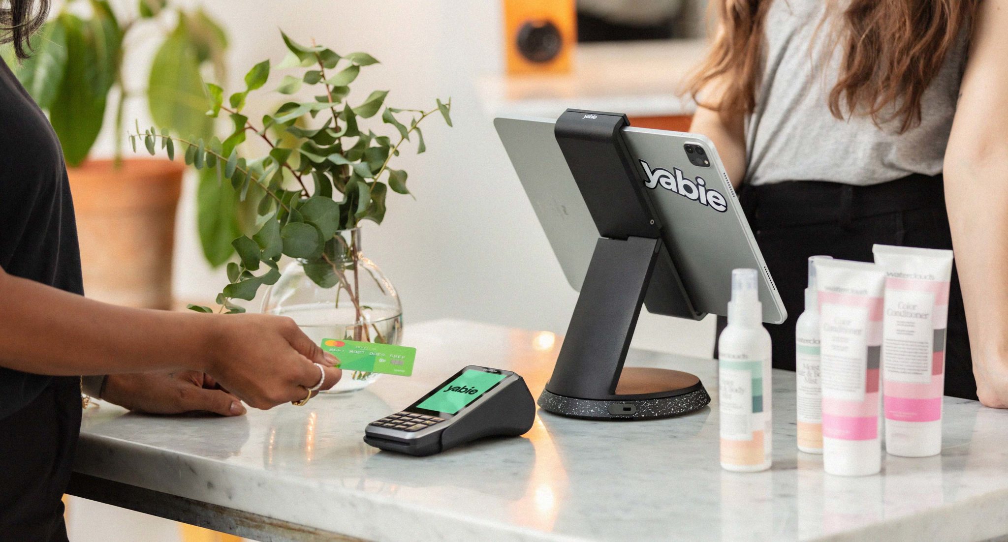
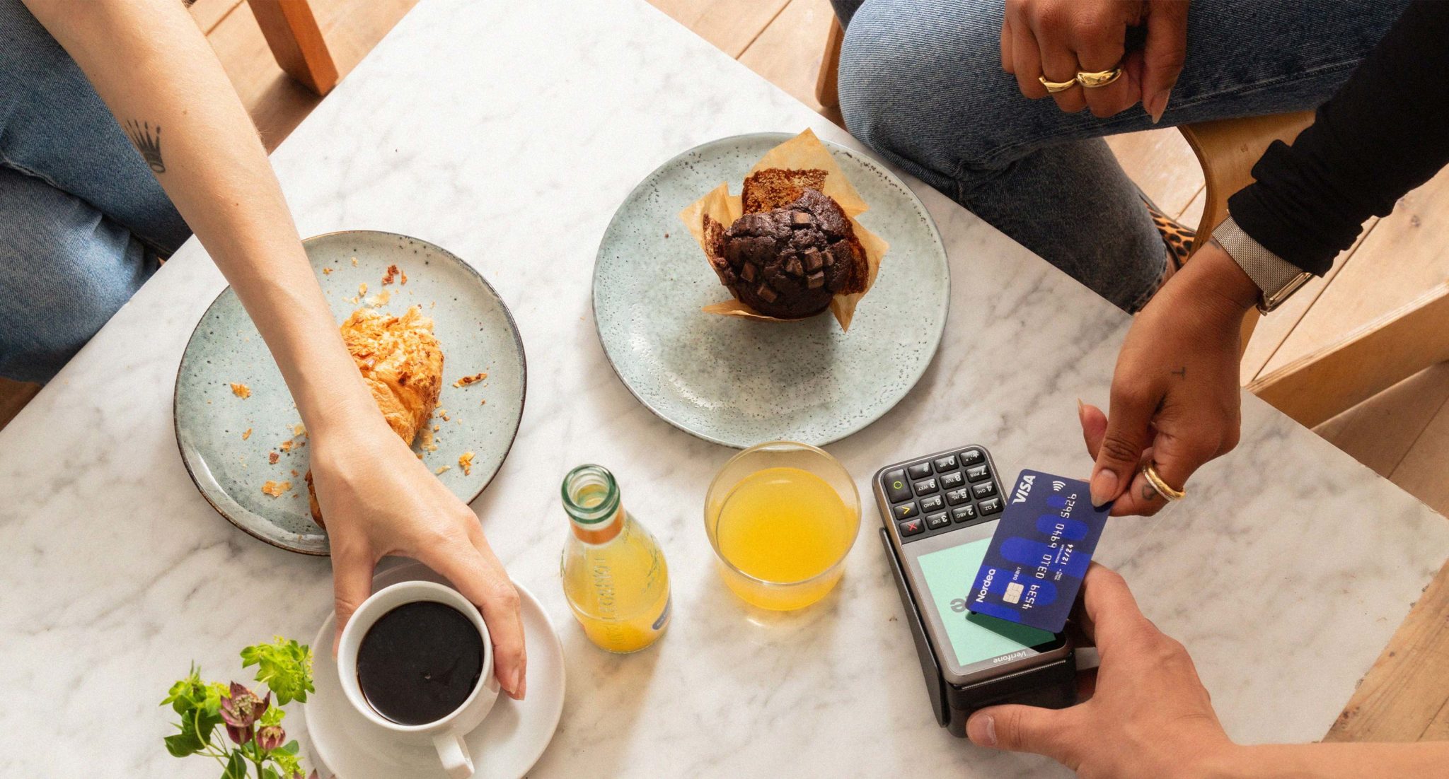
To be certain that we are always on-brand, I launched the project of in-house photoshoots. That way I made sure that we showcased the right hardware, maintained the brand tonality, and integrated our brand colours in our images and videos. I designed new assets for Yabies’ brand library like illustrations, pictograms, mockups, and presentation templates. I launched new creatives in all paid channels and boosted brand awareness.
Result
A more playful brand today.
Before I joined Yabie, a lot of the design work was outsourced with varied quality. After bringing everything back in-house, we see a much more streamlined outcome. By further developing the brand, and putting words into action, Yabies’ visual identity has been realized, strengthened, and more on-brand.
Yabie now has a presence in social media, on-brand prints, new presentation material, and an internal image and video library. With these new elements and tools, Yabie has an easier path to new industries and markets, to continue its growth.
Showcasing Yabies' intuitivity, connecting to one of the brand values.
Showcasing Yabies' intuitivity, connecting to one of the brand values.